Color is an important element in website design, because it affects the emotions, behavior and decisions of users. A website with the right color for the content, audience and goals will make a good impression, attract customers and increase conversion rates.
On the contrary, a website with a color scheme that is not harmonious, does not show the brand identity or is not suitable for the industry will cause discomfort, loss of trust and reduce business efficiency.
In this article, we'll learn how color affects your website and the common mistakes of using colors the wrong way.
Color affects the attractiveness of the website
Color is an important element in website design, because it creates emotions, arouses attention and impresses viewers. A website with colors that match the content, audience and goals will attract more visitors than a website with arbitrary, distracting or irrelevant colors.
Some basic rules when choosing colors for the website are:
- Use a harmonious color palette, not too many colors or too few colors.
- Coordinate colors according to the principle of yin and yang, that is, balance between light and dark colors, warm and cool colors, neutrals and highlights.
- Choose colors that match the industry, brand and message you want to convey.
- For example:
- Green is often associated with nature, health and ecology.
- Red is often associated with passion, energy and action.
- Yellow is often associated with joy, luxury and wealth.
Impact on user experience
Color not only beautifies the website, but also affects the way users perceive and interact with the website. A website with friendly, pleasant and consistent colors will create a positive experience for users, making them feel comfortable, trust and want to come back.
In contrast, a website with unpleasant, confusing and inconsistent colors will create a negative experience for users, making them feel uncomfortable, confused and want to leave.
Some ways to use color to improve the user experience are:
- Distinguish different parts of the website: header, menu, body, footer, ...
- Emphasize the important points of the website: logo, slogan, call to action button, …
- Create motion effects: when hovering over a link, an image, a button, ...
- Create a sense of space: use light colors to create a feeling of spaciousness, use dark colors to create a feeling of coziness, etc.
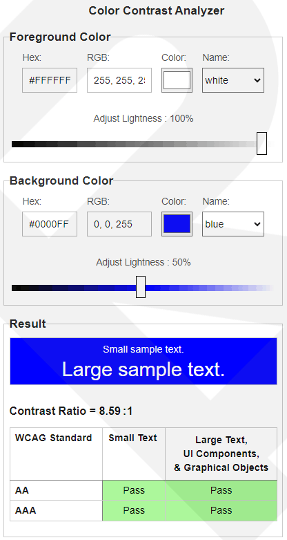
Using tools Color Contrast Analyzer that Google recommends to check the contrast ratio between text color and background color.
Affect the effectiveness of SEO
Not only please the users, but also please the search engines. A website with SEO-optimized colors will be more likely to appear in search results, attract more visits, and increase conversion rates. Some of the benefits of color for SEO are:
- Use code
cssbackground-colorinstead of card<img>If it is a monochrome or gradient image, it helps to speed up the page load because it reduces the size of the image and the source code<html>. - Increase page retention time, because it keeps the user's attention and interest.
- Increase click-through rate, because it highlights titles, keywords and links.
- Increase the prestige and reliability of the website, because it shows the professionalism and quality of the website.
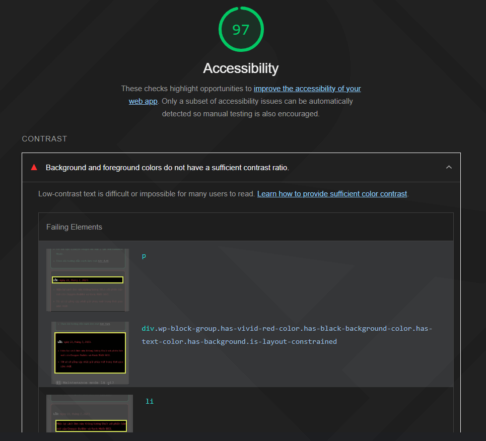
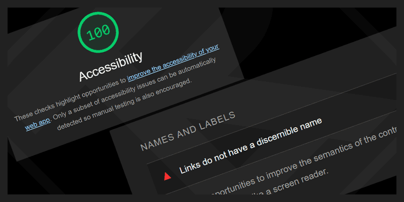
- When using bad colors, it can make your site difficult to read or see, leading to warnings from Google Search Console. You can check this with the tool in Lighthouse.
Common mistakes when using color
Using too many colors: It can make your website look messy and annoying for users. Use only a few dominant colors and combine them harmoniously.
No contrast between text color and background color: make it difficult for users to read the content on your website. Make sure that the text color has a high contrast to the background color so that the user can easily read the content.
Using colors that don't match the website's content and goals: Colors need to match the content and goals of the website. For example, if your website is about a children's product, you should use bright and cheerful colors.
Do not test colors on different devices: Colors may look different on different devices, such as laptops, mobile phones, tablets, and desktop computers. Make sure you test the colors on different devices to make sure they look good and look good on all devices.
Color support tools in website design
Here are some standard color mixing and color testing tools for websites that you can refer to:
- Adobe Color: is a free tool provided by Adobe. This tool allows you to create color palettes, mix colors and test standard colors for your website.
- Coolors: Another free tool that allows you to create color palettes, mix colors and test standard colors for your website. This tool has an intuitive and easy-to-use interface.
- Color Hunt: Nice collection of color palettes. You can use these color schemes for your website.
- Paletton: Free tool that helps you create color palettes according to different color schemes.
- ColorZilla: ColorZilla is an extension for Chrome and Firefox browsers. This extension allows you to take colors from any web page and use it for your website.
In short
Color is an important element in website design and affects the website's attractiveness, user experience, and SEO effectiveness.
To use color effectively, you need to pay attention to factors such as color palette, contrast, number of colors and test on different devices.
In addition, you also need to check for common color errors to make sure your site performs well on all devices.

Comment