如果站点高度不等于设备高度,则将 FOOTER 设为底部
ARTRU

在这篇文章中,我将向您展示如何在网页底部制作FOOTER,以防网站内容低于设备高度。
看来这个功能很少有人使用。因为大多数网站已经有完整的内容并填满屏幕。
但是,请尝试访问您网站上的 404 页面。由于 404 页面通常具有最少的内容,这也意味着它可能不会填满设备屏幕的高度。
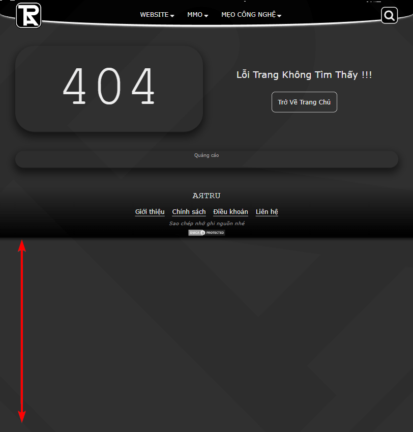
看起来是不是很美观呢?
我使用的填充方法 <body> 是使用 css flex row 结合 min-height: 100vh
这是结构 HTML 必需的:
<body>
  <header>HEADER</header>
  <main>
    <h1>This is a Heading</h1>
    <p>This is a paragraph.</p>
  </main>
  <footer>FOOTER</footer>
</body>
代码 CSS。卡片 <main> 被设定为 flex: 1
body{
margin: unset;
padding: unset;
min-height: 100vh;
display: flex;
flex-direction: column;
}
header{
background-color: #303030;
color: #fff;
height: 50px;
text-align: center;
}
footer{
background-color: black;
color: #fff;
height: 50px;
text-align: center;
}
main{
background-color: #aaa;
flex: 1;
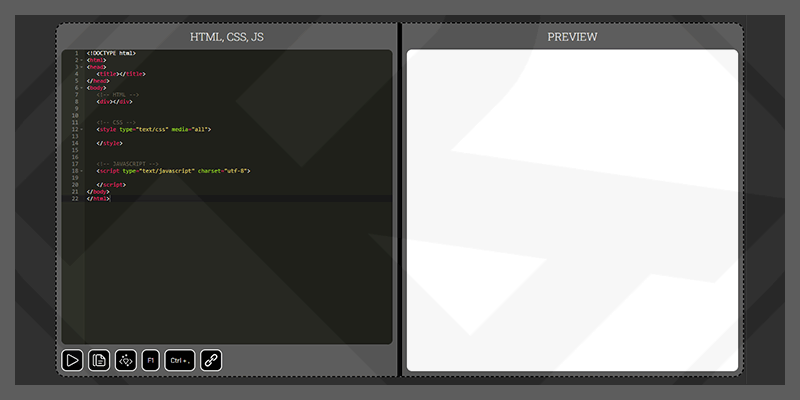
}请参阅下面的 codepen 具体示例。
见笔 FOOTER 位于底部 通过阿特鲁 (@artrublog) 在 代码笔.
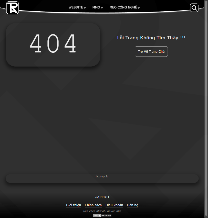
我使用后的结果:
相关文章


 在右上角的浏览器小部件区域中。