In this article, I will show you how to make FOOTER at the bottom of the web page in case the website content is lower than the device height.
It seems that this feature is rarely used by people. Since most websites already have complete content and fill the screen.
However, try accessing the 404 page on your web. Since a 404 page will typically have the least amount of content, this also means it likely won't fill the height of the device screen.
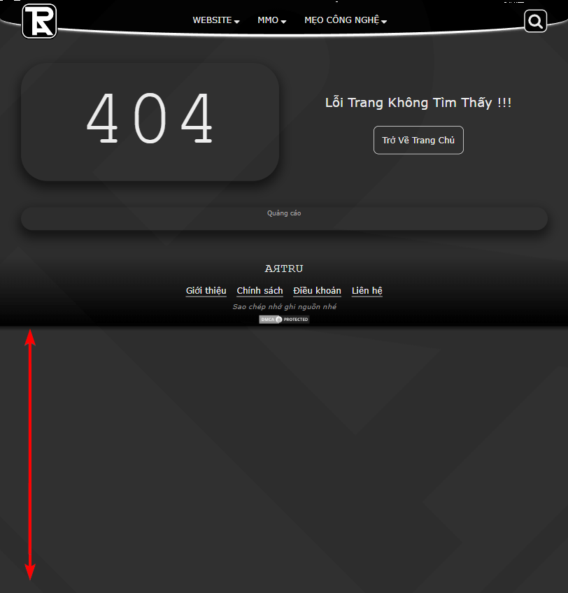
Doesn't it look aesthetically pleasing?
The method I use for filling <body> is to use css flex row combined with min-height: 100vh
This is the structure HTML required:
<body>
  <header>HEADER</header>
  <main>
    <h1>This is a Heading</h1>
    <p>This is a paragraph.</p>
  </main>
  <footer>FOOTER</footer>
</body>
Code CSS. card <main> is set to flex: 1
body{
  margin: unset;
  padding: unset;
  min-height: 100vh;
  display: flex;
  flex-direction: column;
}
header{
  background-color: #303030;
  color: #fff;
  height: 50px;
  text-align: center;
}
footer{
  background-color: black;
  color: #fff;
  height: 50px;
  text-align: center;
}
main{
  background-color: #aaa;
  flex: 1;
}
See codepen specific example below.
See the Pen FOOTER is at the bottom by ARTRU (@artrublog) on CodePen.
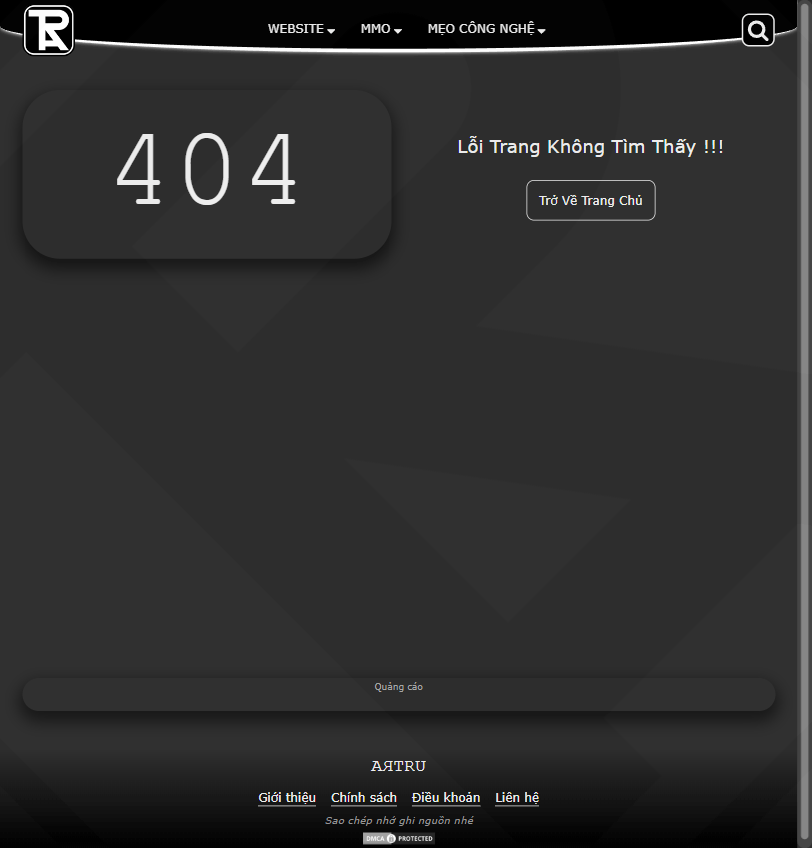
My results after using:

Comment