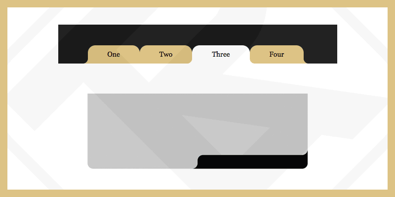
Rounded corners can now be easily implemented via properties border-radius. On the contrary, if you want to round the "outer" corners, you need to customize a few more steps to get the desired result.
You can search for the keyword "Round Out Borders" to learn more methods.
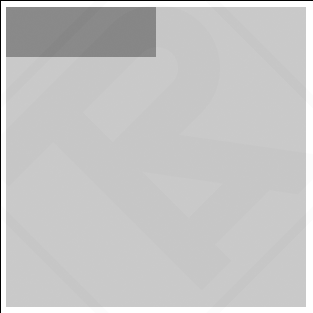
For example: the natural state when the corners are not rounded.
<div class="div-outer">
  <div class="div-inner">
    <div class="div-inner-2">
      <!-- Contents -->
    </div>
  </div>
</div>
<style>
  .div-outer{
    width: 300px;
    height: 300px;
    background-color: #c3c3c3;
  }
  .div-inner{
    width: 50%;
    height: 50px;
    background-color: gray;
  }
</style>
In this case I usually use pseudo elements ::before, ::after to create rounded “outer” corners. But you need 4 pseudo elements to do this. Since pseudo-elements in CSS cannot be created multiple times, I was forced to create 1 more div-inner-2.
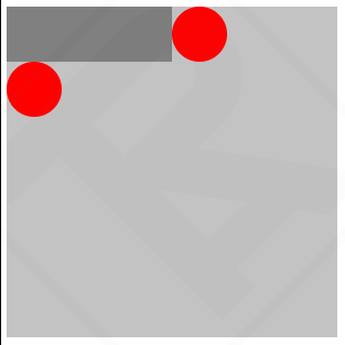
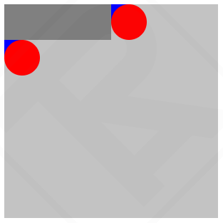
According to the problem, we need to create "outer" corners in 2 locations Top-Right and Bottom-Left
Draw a circle at the corner to be covered with the ::before pseudo element
<div class="div-outer">
<div class="div-inner">
<div class="div-inner-2">
<!-- Contents -->
</div>
</div>
</div>
<style>
.div-outer{
width: 300px;
height: 300px;
background-color: #c3c3c3;
}
.div-inner{
width: 50%;
height: 50px;
background-color: gray;
position: relative;
}
.div-inner::before{
content: "";
width: 50px;
height: 50px;
position: absolute;
background-color: red;
right: -50px;
top: 0;
border-radius: 50%;
}
.div-inner-2::before{
content: "";
width: 50px;
height: 50px;
position: absolute;
background-color: red;
left: 0;
bottom: -50px;
border-radius: 50%;
}
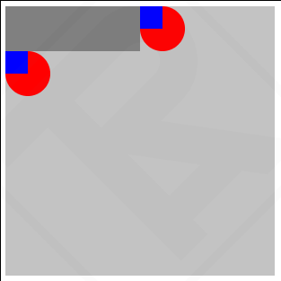
</style>Draw an additional square at the corner that needs to be rounded using the ::after pseudo element
<div class="div-outer">
  <div class="div-inner">
    <div class="div-inner-2">
      <!-- Contents -->
    </div>
  </div>
</div>
<style>
  .div-outer{
    width: 300px;
    height: 300px;
    background-color: #c3c3c3;
  }
  .div-inner{
    width: 50%;
    height: 50px;
    background-color: gray;
    position: relative;
  }
  .div-inner::before{
    content: "";
    width: 50px;
    height: 50px;
    position: absolute;
    background-color: red;
    right: -50px;
    top: 0;
    border-radius: 50%;
  }
  .div-inner::after{
    content: "";
    width: 25px;
    height: 25px;
    position: absolute;
    background-color: blue;
    right: -25px;
    top: 0;
  }
  .div-inner-2::before{
    content: "";
    width: 50px;
    height: 50px;
    position: absolute;
    background-color: red;
    left: 0;
    bottom: -50px;
    border-radius: 50%;
  }
  .div-inner-2::after{
    content: "";
    width: 25px;
    height: 25px;
    position: absolute;
    background-color: blue;
    left: 0;
    bottom: -25px;
  }
</style>
Set z-index: 10 for the circle, then change the background-color accordingly and you will achieve the result.
<div class="div-outer">
  <div class="div-inner">
    <div class="div-inner-2">
      <!-- Contents -->
    </div>
  </div>
</div>
<style>
  .div-outer{
    width: 300px;
    height: 300px;
    background-color: #c3c3c3;
  }
  .div-inner{
    width: 50%;
    height: 50px;
    background-color: gray;
    position: relative;
    border-radius: 0px 0px 25px 0px;
  }
  .div-inner::before{
    content: "";
    width: 50px;
    height: 50px;
    position: absolute;
    background-color: #c3c3c3;
    right: -50px;
    top: 0;
    border-radius: 50%;
    z-index: 10;
  }
  .div-inner::after{
    content: "";
    width: 25px;
    height: 25px;
    position: absolute;
    background-color: gray;
    right: -25px;
    top: 0;
  }
  .div-inner-2::before{
    content: "";
    width: 50px;
    height: 50px;
    position: absolute;
    background-color: #c3c3c3;
    left: 0;
    bottom: -50px;
    border-radius: 50%;
    z-index: 10;
  }
  .div-inner-2::after{
    content: "";
    width: 25px;
    height: 25px;
    position: absolute;
    background-color: gray;
    left: 0;
    bottom: -25px;
  }
</style>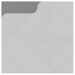
Other examples
See the Pen Round Out Borders by ARTRU (@artrublog) on CodePen.


Comment