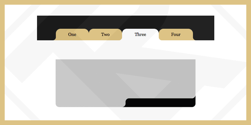
Các góc bo tròn giờ đây có thể dễ dàng thực hiện thông qua thuộc tính border-radius. Ngược lại, nếu bạn muốn bo tròn góc “bên ngoài” thì cần phải tùy chỉnh thêm một vài bước để có được kết quả như ý muốn.
Bạn có thể tìm kiếm keyword “Round Out Borders” để biết được nhiều phương pháp hơn.
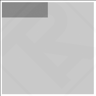
Ví dụ: trạng thái tự nhiên khi chưa được bo góc.
<div class="div-outer">
  <div class="div-inner">
    <div class="div-inner-2">
      <!-- Contents -->
    </div>
  </div>
</div>
<style>
  .div-outer{
    width: 300px;
    height: 300px;
    background-color: #c3c3c3;
  }
  .div-inner{
    width: 50%;
    height: 50px;
    background-color: gray;
  }
</style>
Trong thường hợp này tôi sử dụng phần tử giả ::before, ::after để tạo bo góc “bên ngoài”. Nhưng bạn cần có 4 phần tử giả để làm điều này. Vì phần tử giả trong CSS không thể tạo nhiều nên tôi buộc phải tạo thêm 1 div-inner-2.
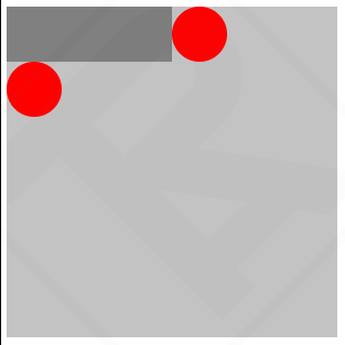
Theo đề bài, chúng ta cần tạo bo góc “bên ngoài” ở 2 vị trí Top-Right và Bottom-Left
Vẽ hình tròn tại góc cần bo bằng phần tử giả ::before
<div class="div-outer">
<div class="div-inner">
<div class="div-inner-2">
<!-- Contents -->
</div>
</div>
</div>
<style>
.div-outer{
width: 300px;
height: 300px;
background-color: #c3c3c3;
}
.div-inner{
width: 50%;
height: 50px;
background-color: gray;
position: relative;
}
.div-inner::before{
content: "";
width: 50px;
height: 50px;
position: absolute;
background-color: red;
right: -50px;
top: 0;
border-radius: 50%;
}
.div-inner-2::before{
content: "";
width: 50px;
height: 50px;
position: absolute;
background-color: red;
left: 0;
bottom: -50px;
border-radius: 50%;
}
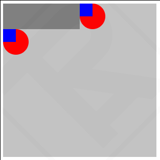
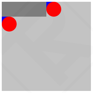
</style>Vẽ thêm hình vuông tại góc cần bo bằng phần từ giả ::after
<div class="div-outer">
  <div class="div-inner">
    <div class="div-inner-2">
      <!-- Contents -->
    </div>
  </div>
</div>
<style>
  .div-outer{
    width: 300px;
    height: 300px;
    background-color: #c3c3c3;
  }
  .div-inner{
    width: 50%;
    height: 50px;
    background-color: gray;
    position: relative;
  }
  .div-inner::before{
    content: "";
    width: 50px;
    height: 50px;
    position: absolute;
    background-color: red;
    right: -50px;
    top: 0;
    border-radius: 50%;
  }
  .div-inner::after{
    content: "";
    width: 25px;
    height: 25px;
    position: absolute;
    background-color: blue;
    right: -25px;
    top: 0;
  }
  .div-inner-2::before{
    content: "";
    width: 50px;
    height: 50px;
    position: absolute;
    background-color: red;
    left: 0;
    bottom: -50px;
    border-radius: 50%;
  }
  .div-inner-2::after{
    content: "";
    width: 25px;
    height: 25px;
    position: absolute;
    background-color: blue;
    left: 0;
    bottom: -25px;
  }
</style>
Đặt z-index: 10 cho hình tròn, sau đó đổi màu background-color cho phù hợp và bạn sẽ đạt được kết quả.
<div class="div-outer">
  <div class="div-inner">
    <div class="div-inner-2">
      <!-- Contents -->
    </div>
  </div>
</div>
<style>
  .div-outer{
    width: 300px;
    height: 300px;
    background-color: #c3c3c3;
  }
  .div-inner{
    width: 50%;
    height: 50px;
    background-color: gray;
    position: relative;
    border-radius: 0px 0px 25px 0px;
  }
  .div-inner::before{
    content: "";
    width: 50px;
    height: 50px;
    position: absolute;
    background-color: #c3c3c3;
    right: -50px;
    top: 0;
    border-radius: 50%;
    z-index: 10;
  }
  .div-inner::after{
    content: "";
    width: 25px;
    height: 25px;
    position: absolute;
    background-color: gray;
    right: -25px;
    top: 0;
  }
  .div-inner-2::before{
    content: "";
    width: 50px;
    height: 50px;
    position: absolute;
    background-color: #c3c3c3;
    left: 0;
    bottom: -50px;
    border-radius: 50%;
    z-index: 10;
  }
  .div-inner-2::after{
    content: "";
    width: 25px;
    height: 25px;
    position: absolute;
    background-color: gray;
    left: 0;
    bottom: -25px;
  }
</style>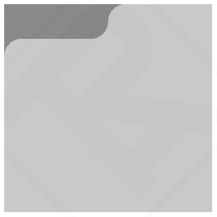
Ví dụ khác
See the Pen Round Out Borders by ARTRU (@artrublog) on CodePen.

Bình luận