Use the unit “REM”
Use units REM for tags p, h1-h6, a Helps you save time when editing font sizes in bulk.
For example:
:root {
    font-size: 16px;
}

h1 {
    font-size: 2rem;
}
When I change font-size original is card <h1> also change accordingly.
Suppose:
:root{font-size: 16px;}then card<h1>will have size32px.:root{font-size: 20px;}then card<h1>will have size40px.
See the Pen Ex: REM UNIT font-size by ARTRU (@artrublog) on CodePen.
Replace unit “px” with “%”
This you can refer to, not necessarily converted into units %.
When font-size is fixed with px. It will help the website layout not to move even if the user sets the font to be larger or smaller than the default (16px is the default for all devices), especially on mobile devices.
If you want the website to respect the user's font-size. You can use the % unit instead.
Specifically here is 62.5% = 10px when the user sets the default font size.
Based on that ratio I use 6.25% = 1px to combine units REM easier.
For example I want tags <h1> If the font size is 32px then:
:root{font-size:then card62.5%;}h1{font-size: 3.2rem;}.:root{font-size:then card6.25%;}h1{font-size: 32rem;}.
See the Pen Ex: % UNIT font-size by ARTRU (@artrublog) on CodePen.
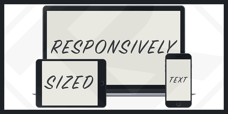
Create font-size Reponsize
Creating font-size Responsive means the font size will change according to each screen size.
You can hard set the font-size for each device width.
For example:
<p>Lorem ipsum dolor sit amet consectetur adipisicing elit. Nemo, consectetur quas incidunt quibusdam deserunt cum non,
  quasi facere labore repudiandae, mollitia harum dolores sed ad voluptatem adipisci pariatur ex inventore.</p>
<style>
  /* Mobile */
  @media(max-width: 479px) {
    body {
      font-size: 16px;
    }
  }

  /* Tablet */
  @media(min-width: 480px) and (max-width: 1024px) {
    body {
      font-size: 26px;
    }
  }

  /* Desktop */
  @media(min-width: 1025px) {
    body {
      font-size: 40px;
    }
  }
</style>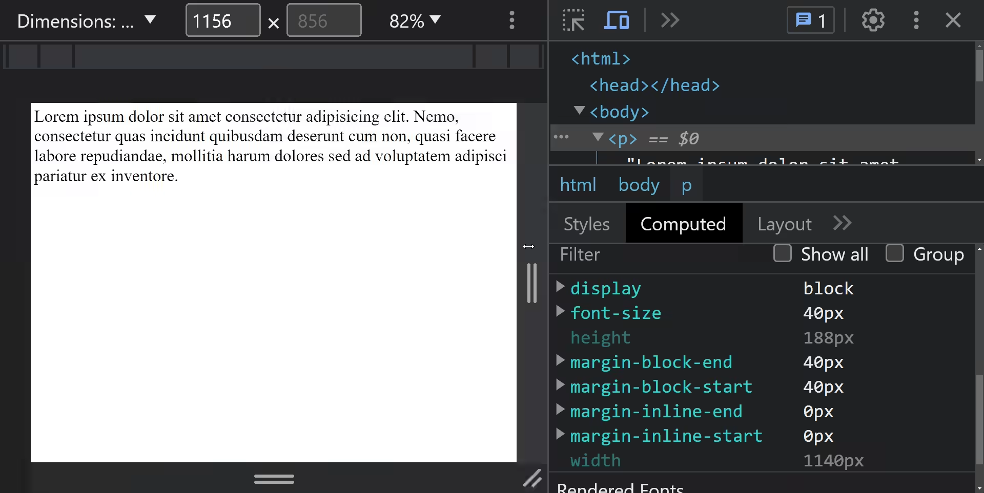
However, the above method will not be flexible because there are currently many devices with many different sizes.
I use functions calc makes the code shorter and more maneuverable in scaling the screen.
Let's visit the tool Fluid-responsive property calculator.
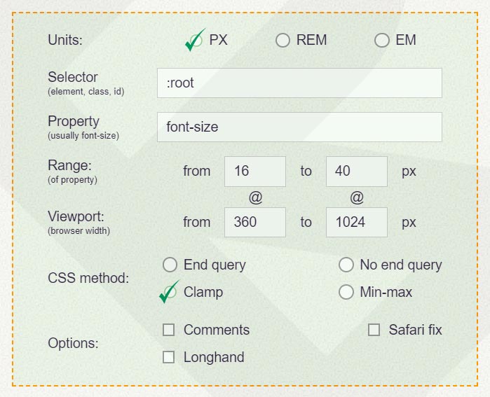
Item Units you can choose the unit you want. I will use it px.
Item Range is the font-size margin as in the example I set 16px-40px.
Item Viewport is the screen width size range (width). I'll put the word 360px-1024px.
In the section CSS method you select the box Clamp. Then you just need to copy the CSS code created below.
<p>Lorem ipsum dolor sit amet consectetur adipisicing elit. Nemo, consectetur quas incidunt quibusdam deserunt cum non,
  quasi facere labore repudiandae, mollitia harum dolores sed ad voluptatem adipisci pariatur ex inventore.</p>
<style>
  body {
    font-size: clamp(16px, calc(1rem + ((1vw - 3.6px) * 3.6145)), 40px);
  }
</style>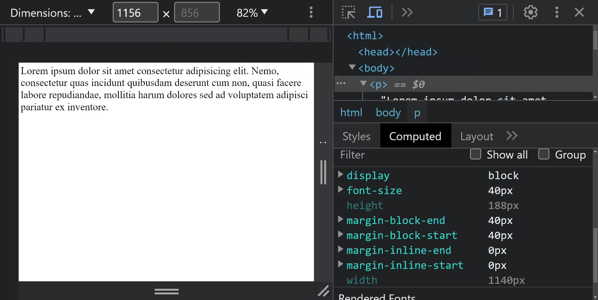

Comment