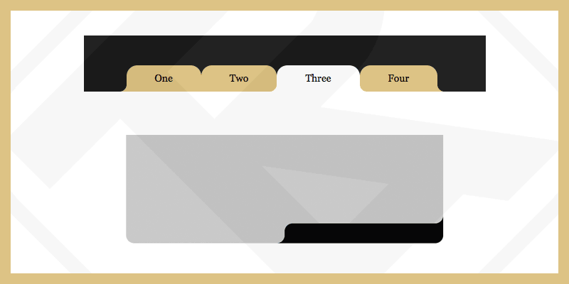
创建圆形边框
ARTRU

表格的内容
现在可以通过属性轻松实现圆角 border-radius。相反,如果你想把“外”角变成圆角,则需要自定义更多步骤才能获得所需的结果。
您可以搜索关键字“Round Out Borders”了解更多方法。
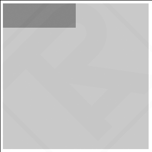
<div class="div-outer">
  <div class="div-inner">
    <div class="div-inner-2">
      <!-- Contents -->
    </div>
  </div>
</div>
<style>
  .div-outer{
    width: 300px;
    height: 300px;
    background-color: #c3c3c3;
  }
  .div-inner{
    width: 50%;
    height: 50px;
    background-color: gray;
  }
</style>
在这种情况下我通常使用伪元素 ::before, ::after 创建“外”角圆角。但你需要 4 个伪元素才能做到这一点。由于CSS中的伪元素不能多次创建,所以我被迫再创建1个 div-inner-2.
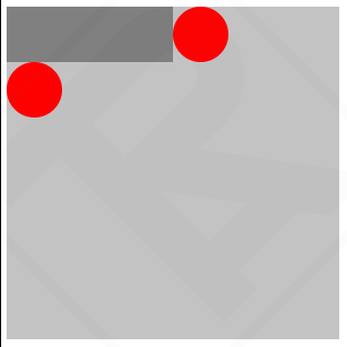
根据问题,我们需要在2个位置创建“外”角圆角 Top-Right 和 Bottom-Left
<div class="div-outer">
  <div class="div-inner">
    <div class="div-inner-2">
      <!-- Contents -->
    </div>
  </div>
</div>
<style>
  .div-outer{
    width: 300px;
    height: 300px;
    background-color: #c3c3c3;
  }
  .div-inner{
    width: 50%;
    height: 50px;
    background-color: gray;
    position: relative;
  }
  .div-inner::before{
    content: "";
    width: 50px;
    height: 50px;
    position: absolute;
    background-color: red;
    right: -50px;
    top: 0;
    border-radius: 50%;
  }
  .div-inner-2::before{
    content: "";
    width: 50px;
    height: 50px;
    position: absolute;
    background-color: red;
    left: 0;
    bottom: -50px;
    border-radius: 50%;
  }
</style>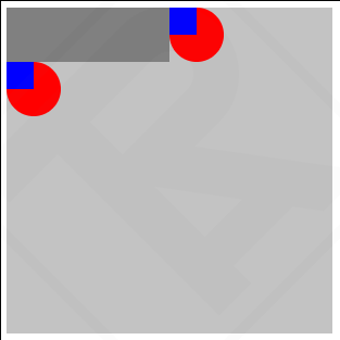
<div class="div-outer">
  <div class="div-inner">
    <div class="div-inner-2">
      <!-- Contents -->
    </div>
  </div>
</div>
<style>
  .div-outer{
    width: 300px;
    height: 300px;
    background-color: #c3c3c3;
  }
  .div-inner{
    width: 50%;
    height: 50px;
    background-color: gray;
    position: relative;
  }
  .div-inner::before{
    content: "";
    width: 50px;
    height: 50px;
    position: absolute;
    background-color: red;
    right: -50px;
    top: 0;
    border-radius: 50%;
  }
  .div-inner::after{
    content: "";
    width: 25px;
    height: 25px;
    position: absolute;
    background-color: blue;
    right: -25px;
    top: 0;
  }
  .div-inner-2::before{
    content: "";
    width: 50px;
    height: 50px;
    position: absolute;
    background-color: red;
    left: 0;
    bottom: -50px;
    border-radius: 50%;
  }
  .div-inner-2::after{
    content: "";
    width: 25px;
    height: 25px;
    position: absolute;
    background-color: blue;
    left: 0;
    bottom: -25px;
  }
</style>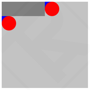
<div class="div-outer">
  <div class="div-inner">
    <div class="div-inner-2">
      <!-- Contents -->
    </div>
  </div>
</div>
<style>
  .div-outer{
    width: 300px;
    height: 300px;
    background-color: #c3c3c3;
  }
  .div-inner{
    width: 50%;
    height: 50px;
    background-color: gray;
    position: relative;
    border-radius: 0px 0px 25px 0px;
  }
  .div-inner::before{
    content: "";
    width: 50px;
    height: 50px;
    position: absolute;
    background-color: #c3c3c3;
    right: -50px;
    top: 0;
    border-radius: 50%;
    z-index: 10;
  }
  .div-inner::after{
    content: "";
    width: 25px;
    height: 25px;
    position: absolute;
    background-color: gray;
    right: -25px;
    top: 0;
  }
  .div-inner-2::before{
    content: "";
    width: 50px;
    height: 50px;
    position: absolute;
    background-color: #c3c3c3;
    left: 0;
    bottom: -50px;
    border-radius: 50%;
    z-index: 10;
  }
  .div-inner-2::after{
    content: "";
    width: 25px;
    height: 25px;
    position: absolute;
    background-color: gray;
    left: 0;
    bottom: -25px;
  }
</style>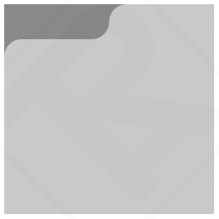
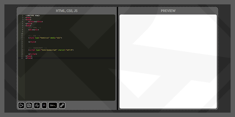
见笔 圆润边框 通过阿特鲁 (@artrublog) 在 代码笔.
相关文章


 在右上角的浏览器小部件区域中。